When the members of your target market are scrolling through their social media feeds, they’re looking for one thing in particular…
A reason to stop.
They’re looking for something that piques their interest, grabs their attention…lights their fire.

And that thing is likely to be an image.
In fact, using high-quality, highly relevant social media images is said to double your social media engagement.
Using high-quality, highly relevant images is said to double your social media engagement.
Too many great messages are overlooked because an image’s quality is low, or because it simply doesn’t capture the attention of the right people. It’s time we small business women learned how to change that and prove that you don’t need a massive design budget to succeed on social media!
Start with the Message
If you’re not sure what you’re trying to say, then it will be utterly impossible to choose the right image.
You’ve heard that a picture is worth a thousand words, but honestly, I’m not sure a thousand words can say what a single image does. The things we see with our eyes are thick with unspoken messages—often absorbed by our subconscious minds, without conscious awareness. We might get a “feeling” from a photo, but have no hard evidence to support that feeling. We might be drawn to one image over another, without knowing why. These are just a few examples of why choosing the right social media image can wholly determine how your message lands.
First, decide what you want to say. Write it down. Think it over. Absorb that message before you go looking for the perfect image.
First, decide what you want to say. Write it down. Think it over. Absorb that message before you go looking for the perfect image.
And then…
Embody a Mood
Every image has a mood about it, whether that’s melancholy, electrifying, funny, sombre, inspiring, maddening, endearing or comforting.
What mood will your target market be in when they’re presented with your message? What should they be feeling the moment they’re ready to accept your solution to their problem?
Narrow your image choices to only those that embody that mood.
You can take a look at the image and ask yourself how it makes you feel (and if you’re close to the psyche of your ideal client, it will be accurate), or you can take a closer look by asking these questions:
- What story is the image telling? What has happened, and what is about to happen?
- How are the people in the image feeling? What facial expressions and body language cues lead you to believe that?
- If there’s more than one person in the image, what is their relationship to one another? How do you know?
- Does the image display a problem? What is it? What elements prove that?
- What solution does the image exhibit? What evidence is there?
- Finally, with all these elements working together, what emotion do you feel? Is that the emotion your target market needs to feel in order to move closer to contacting your business?
By dissecting an image in this way, you can get to the root of why it elicits a specific emotion…and move one step closer to deciding if it’s the right image to convey your message.
Test it out now – what emotion does this image evoke in you?

Consider Branding and Image Quality
Consistency is a pillar of branding—because if your brand’s message and promise waver, that will cause confusion or negatively affect perceptions.
What are your brand colours? What are its values, mission and vision? All of these things should be at the forefront when you’re choosing social media images. Many times, this will mean using your own, custom-branded images.
The quality of the images you use says a lot about your brand. If they’re grainy or pixelated, what level of quality, or attention to detail, should people expect from your brand? If they’re unimaginative, what level of ingenuity can be expected?
The quality of the images you use says a lot about your brand.
These are the types of questions you should ask yourself before using any image on social media. Remember that every visual sends a message, and that message must support your business if you want to build your brand.
Quality is everything – Which of these images would you associate with a professional, high quality company?

This one?

Or this one?
Although this is the same image, using a photo that is low quality (like the second image), will not impress your audience – it may in fact even damage your reputation.
Stay Relevant, with Your Audience in Mind
This doesn’t mean you’ve got to be on top of trends and stay “cool.” What it does mean is that the images you choose for your social media posts should be significant to, and supportive of, your brand and its timely communications.
Most people like a photo of a colourful butterfly, but if you’re spreading the word about an upcoming finance seminar, that photo might not be applicable. Just because something is visually appealing doesn’t mean it’s going to build your brand.
Just because something is visually appealing doesn’t mean it’s going to build your brand. #businessbranding Share on XFurthermore, a highly relevant image that works for one brand may not work for another. Who is your ideal client, really? How well do you know that person? If you’re not certain, then you can’t possibly be choosing images that will pique their interest or speak to their emotions.
Know your target market inside and out, including gender, age, geography, career and family status, culture, etc. This will help you to choose images that are relevant not only to your brand but also to them personally. They will identify with that image; and will stop to learn more.
For instance, if your ideal client is male, he will look for functionality and take special effects into account far more often than a woman will. Females, however, not only look for emotional cues in images, they are far more proficient at decoding subliminal messages. Men are concerned with specs or details, whilst women are more concerned with the final product. Men want to know how it works; women want to know why it’s a good idea. Men want to see details; women want to see how the product or service is going to make them feel.
Keep these differences in mind as you choose images for your specific target market.
The Right Images (Type and Size) for Each Social Media Platform
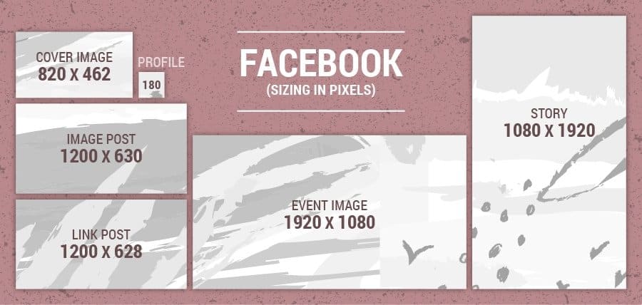
Before you share the same image across all social media platforms, take the time to make some individual considerations for each. To assist you in doing this, here are some guidelines that specify the appropriate dimensions in pixels (px).
Please be advised however that these dimensions are only a guideline and may change in the future, so do your research before posting.
The goal here is to build your brand and engage, engage, engage! The images and accompanying text should be informative and give valuable advice. The way you see images on your timeline isn’t necessarily the way they’re showing up in users’ newsfeeds. Stick to these minimum dimensions to make sure they display correctly:
- Profile: 180×180 px (circular)
- Cover Photos: 820×315/462 px
- Story: 1080×1920
- Link Post: 1200×628 px
- Event Image: 1920×1080 px
- Image Post: 1200×630 px (Up to 4 images will display, but can be expanded to view more.)
We’ve found the optimal size for a Facebook Cover Image to be 820×462 px. However, when you are viewing Facebook image posts on a desktop it will only show 820x312px (if you’ve posted an image that is 820×462 px, it will crop both the top and the bottom of the image), however, for those viewing on a mobile, the entire image will show.
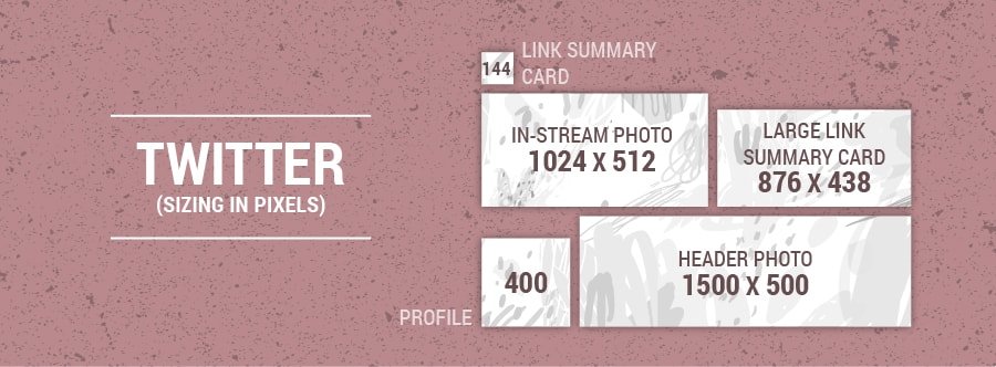
Twitter users want the latest, so the best images for this platform are newsworthy ones. They will display at approximately half the size of the upload, but for the best quality, stick to these dimensions:
- Profile Photo: 400×400 px
- Header Photo: 1500×500 px
- In-Stream Photo: 1024×512 px (Share up to 4 per Tweet, all of which will be visible in a collage.)
- Link Summary Card (square): 144×144
- Large Link Summary Card (rectangular): 876×438 px
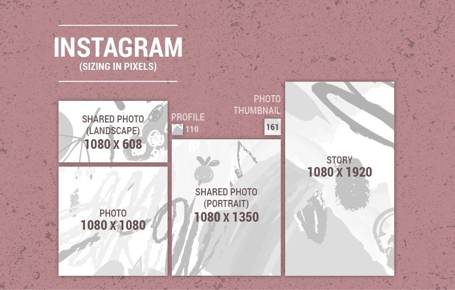
This platform is all about stunning, high-resolution photography. Because Instagram is rooted in the visual, it’s crucial that you follow image guidelines.
- Profile Picture: 110×110 px
- Photos (Square): 1080×1080 px (Share up to 10 photos, with only the first visible without swiping.)
- Shared Photo (Portrait): 1080×1350 px
- Shared Photo (Landscape): 1080×608 px
- Photo Thumbnail: 161×161 px
- Story Photo: 1080×1920 px
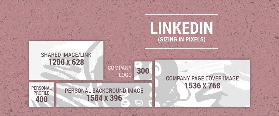
This is the most professional social media platform, so it’s imperative that you present yourself in a businesslike manner (and that includes high-quality images). Images that support company and industry news are best.
All should be PNG, GIF or JPG files.
- Personal Profile: 400×400 px (not to exceed 20,000×20,000 px)
- Personal Background Image: 1584×396 px
- Company Logo: 300×300 px
- Company Page Cover Image: 1536×768 px
- Shared Image/Link: 1200×628 px (Add up to 9 photos at a time. Only the first five will display, but can be expanded to view the rest.)
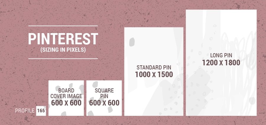
This one is for visual learners, particularly, so detailed how-to photos and infographics work best. Filled with external links, Pinterest has the power to send people to your website…if the images are of high-quality resolution and adhere to these minimum size requirements.
- Profile Picture: 165×165 px
- Pins:
- Square Pin: 600×600 px
- Standard Pin: 1000×1500 px (this is the optimal pin size)
- Long Pin: 1200×1800 px
- Board Cover Image: 600×600 px
How to Stand Out in Their Feeds
Maybe you’ve noticed that each social media platform has its own branded background colour. One trick for standing out is to choose or create images with colours that stand out against that background. This means a different image (or image colours) for each platform…but the high-intensity result will be worth it.
Another way to stand out is to use images that have contrasting colours within themselves. Clothing that doesn’t blend with the background, etc.
You’ll also want to consider the composition of each image, for aesthetic and messaging reasons. The composition includes elements like the choice of focal point, alignment, cropping and white space. Changing the composition of a shot can change the emotion, the mood and impact of any image.
What to Consider when Selecting Stock Images
If you’re going to use stock photos, there are a few things you should consider. First, you’re not going to get a unique, branded image that conveys the precise message you’re aiming for. You might be able to get close, but then you’ll run the risk of duplicating another business’s post. So, be vigilant.
Also, make sure that you’re reading the fine print. Even if an image is free, there might be stipulations regarding credit and notification. Skip over this, and you could find yourself in hot water.
Free doesn’t always mean you get less. Paid stock photography has a tendency to be more cliché, more predictable. On the other hand, you’ll see far more options if you add paid images to your search, you will be certain that you own the rights to the image, the quality is likely to be much better and there’s often greater editing flexibility.
A few sites I like to use?
Freeimages.com offers just what it says, free images, but you’ll also see paid options from iStock while you’re there. Another great site is Canva – they have Free and Premium images.
However, Canva is not limited to stock images. In fact, it is a fantastic website for creating your own graphics for social media.
If you’re design-savvy then I highly recommend giving Canva a go. By creating graphics or images that are uniquely branded to fit your business (such as including your Instagram handle and using brand colours and fonts) you appeal more to your target market and you will increase your brand awareness. If people like the graphics that you are creating, they will share them with their audience!
Additional Tips for Choosing the Right Images for Social Media
Use Images with People
In general, as you’re choosing photos, know that humans identify and gather tonnes of information from other human faces, so use them! Images of people also help your target market to more closely identify with your message—when they see other people doing what they do, feeling what they feel or experiencing what they experience.
Crop Strategically
If you’re promoting a past event, take the shot (or crop the shot) so the room looks full. Empty chairs are never good for raising perceptions.
Don’t Add Too Much Text
Allow your images to speak for themselves. Over-explaining with text can dull the impact of your visuals.
Share Other People’s Images
Keep an eye out for artists and other influencers who post images that support your brand’s message—even if they hadn’t intended to. Remember to always give credit to the original author/artist, and never edit others’ images that you share.
____________________________
How will your social media image strategy be changing? What have you learned that you will be implementing? Do you have questions or points you’d like to add? Please use the comment section below to get the conversation started, and as always, you are encouraged to join in!
And if you’re struggling with your social media and want to learn how to master the complete content creation process, click here and sign up for our Ultimate Guide to Social Media Content Creation course!
This article was co-written by Fempire team members Jo Baker and Anna Gratte.
Anna Gratte is a marketing intern at Fempire. She has a keen interest in social media and content creation and is passionate about creating engaging content that inspires women to achieve success and live a fulfilled life.


0 Comments
Trackbacks/Pingbacks